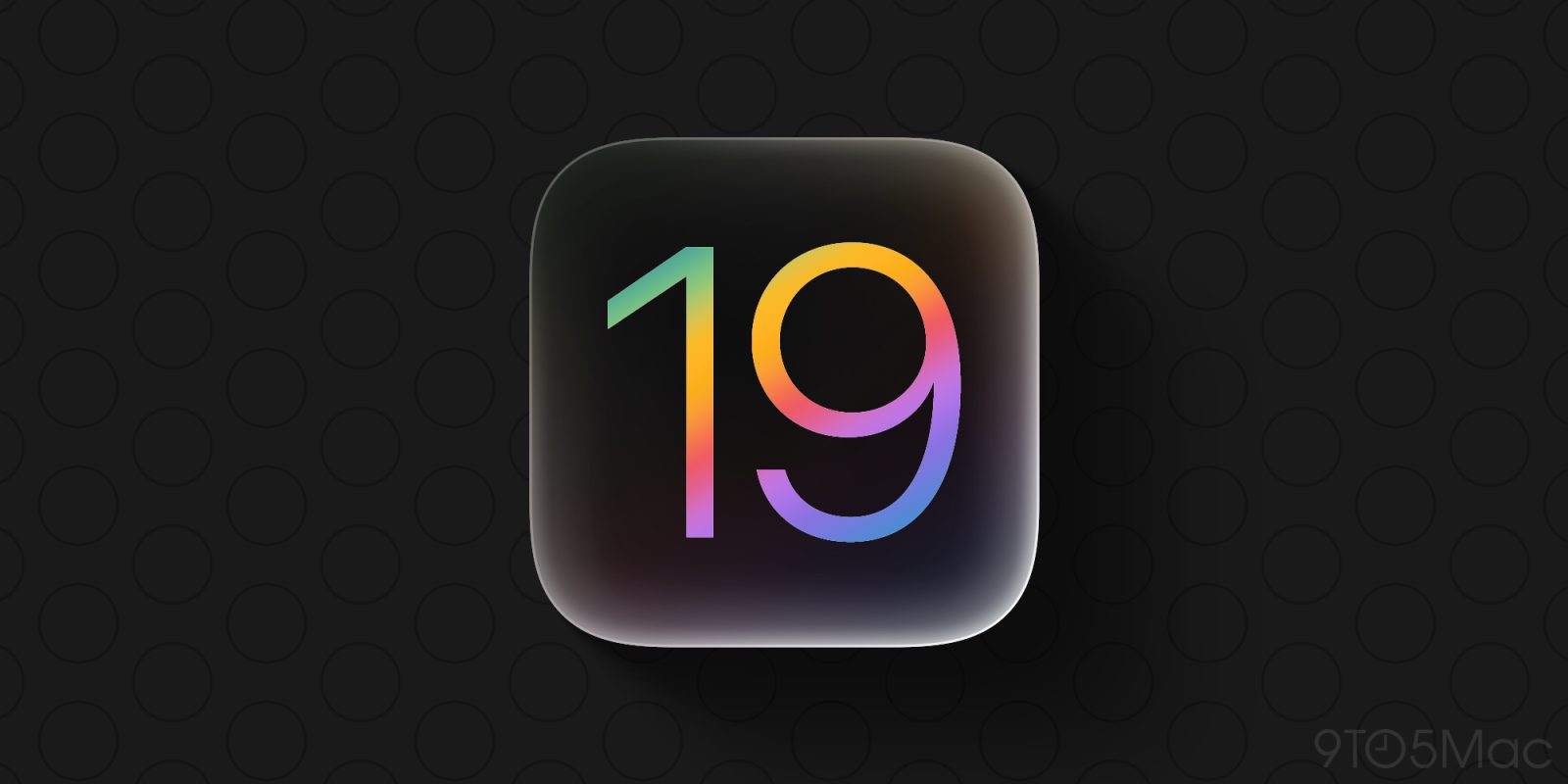
Last week Bloomberg’s Mark Gurman held a live Q&A where he answered a variety of questions about Apple. Here’s what he revealed about iOS 19’s upcoming brand new design.
Major redesign themes include consistency, ‘glass effect,’ and usability
Mark Gurman has reported several times on iOS 19’s new design, but normally only in published Bloomberg works. But a few days ago he was on a call where he had the unique opportunity to speak more casually about what’s coming.
According to the official transcript, at one point Gurman is asked: “You’ve reported that iOS 19 will feature a major redesign. What makes it so significant?”
Here’s what he had to share:
The big thing with this redesign is consistent controls, icons, buttons, user interface dynamics and mechanisms across both iOS and macOS. The interfaces between the iPad, the Mac and the iPhone, they have a lot of similarities, but they have a lot of differences.
Things like hamburger menus and menu buttons, and the menu bar, and buttons for closing applications, the way the dock looks and acts. There are a lot of differences across the operating system. So it’s about adding consistency there. It’s about adding glassy effects across the user interface. It’s about rejiggering some applications for a new generation of users to better understand, to make it seem more unified between the individual and the devices. So it’s gonna be a pretty dramatic set of changes. It could take a little bit of getting used to, but I think in the end people are going to like it.
In a follow-up, Gurman is then asked if every single Apple app will get the new design. Is it possible that only certain apps will be updated, while others remain unchanged?
Here’s his response:
I can’t speak for every app, but I would imagine that [with] the core applications you’re going to see the user interface elements updated to be more akin to visionOS, to get this consistency across both platforms, to get this consistent, the glass effects throughout the the user interface.
Top comment by Graham Jones
It’s one of those that makes you nervous but also excited at the same time, and you’re not sure which side the coin will land. Can’t wait for WWDC.
Finally, he rounds out the iOS 19 focus by emphasizing how significant he expects the changes to be:
I think it’s going to be the biggest redesign to iOS since iOS 7 over 10 years ago back in 2013. So, it’s going to be quite a bit different, right? That new glass effect I think is going to be quite interesting and I think it’s going to look good.
9to5Mac’s Take
It’s undoubtedly hard to describe the significance of updated visual elements in iOS when you’re unable to actually show anyone what you’ve seen. But some of Gurman’s tidbits here, and especially the elements he chooses to emphasize, are worth noting.
For example, his multiple references and praise for a “new glass effect.” It sounds like there’s a chance these UI elements could be responsive to a user’s movements while holding the iPhone, similar to how tvOS and visionOS work. That would be a change that’s impossible to show in a screenshot, even when you commission mockups.
What do you think of Gurman’s new iOS 19 design tidbits? How are you feeling about the rumored redesign overall? Let us know in the comments.
Best iPhone accessories
- AirPods Pro 2 (now only $169, down from $249)
- MagSafe Car Mount for iPhone
- HomeKit smart plug 4-pack
- 10-year AirTag battery case 2-pack
- iPhone desk stand with StandBy and MagSafe
FTC: We use income earning auto affiliate links. More.


Comments