Apple said yesterday that iOS 26 was its biggest update to the look and feel of the iPhone since iOS 7, with the same visual design language used across all the company’s devices.
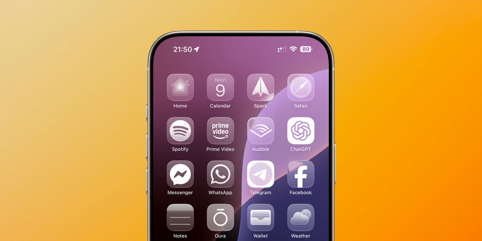
It’s certainly a pretty dramatic change, depending on how far you want to take the look. For example, in addition to the ‘tint’ options we got in iOS 18, there’s a new ‘Clear’ option to make all our app icons monochrome glass – which you can see above …
Like tint, I have to wonder how many people will actually use it, but it’s certainly an interesting look at what happens when you dial up the glass look to the max!
As before, you long-press on a blank part of the Home screen to bring up an Edit button top-left, then hit Customize to bring up this menu:
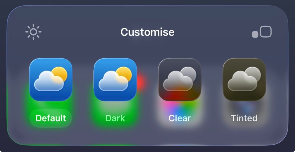
Select Clear, and that’s what you get.
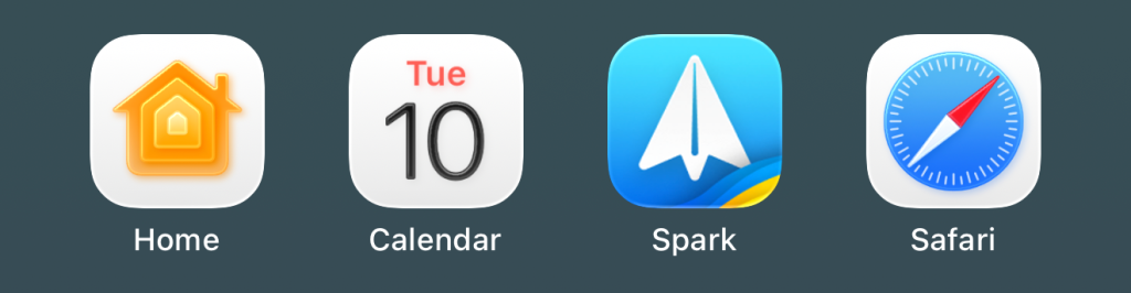
But you don’t have to change the default look to see the glass elements. Here’s a look at some Apple app icons with the new subtle 3D effects – starting with how they appear in the dock:

On the Home screen:
And in folders:
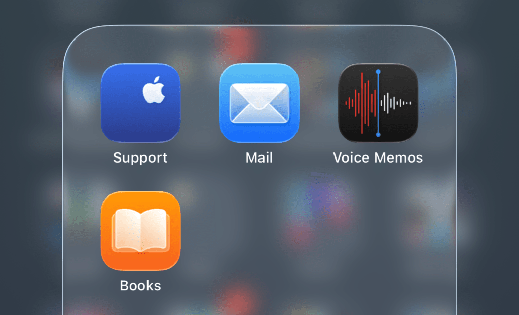
It doesn’t appear that Apple brought any third-party developers into the fold for the first developer beta, as other icons look to be unchanged.
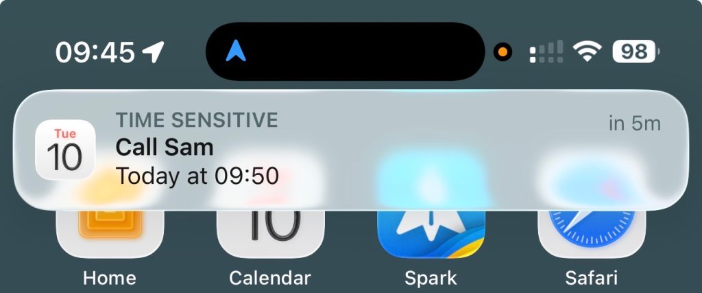
Notifications have a frosted glass look:
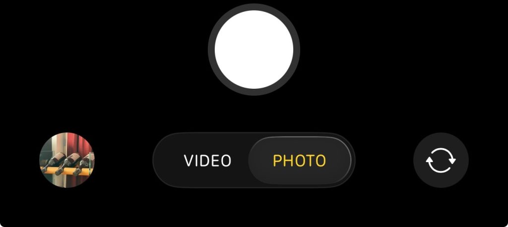
The Camera app has a simplified default UI, with just Photo and Video options:
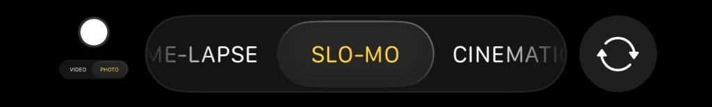
Tapping and holding lets you access the rest:
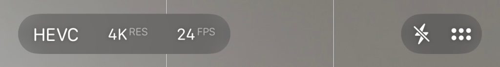
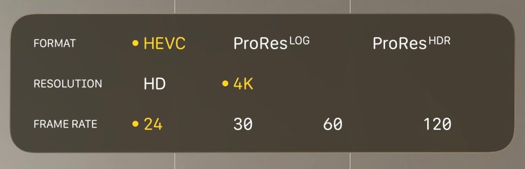
At the top, there’s a simple settings display, showing the current ones:
Top comment by OK
I have to be honest, I do not like it as much as some others. I feel that it is mixing styles (the skeuomorphic camera lens, the cartoonish Games rocket and everything else in between). I also feel that it is at the same time over-designed and unpolished, with areas where one has to read text often very difficult to do so. In macOS, the fact that windows like Finder have no visible header bar, even though it is still there, is also problematic for me. It all just feels too rushed.
Tapping this then expands it into a tappable control panel:
Other apps take the same approach, of things expanding as you need them.
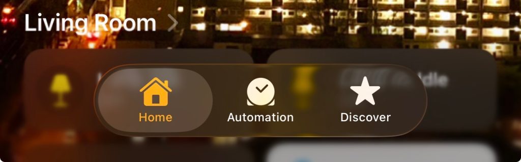
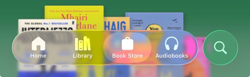
Tab bars floating over content of course have a consistent look across apps.
Of course, this is only the first developer beta, and much may change – but what are your first impressions of the look? Please share your thoughts in the comments.
Highlighted accessories
- Anker 511 Nano Pro ultra-compact iPhone charger
- Spigen MagFit case for iPhone 16e – adds MagSafe support
- Apple MagSafe Charger with 25w power for iPhone 16 models
- Apple 30W charger for above
- Anker 240W braided USB-C to USB-C cable
FTC: We use income earning auto affiliate links. More.


Comments